The Unison Design System
Project Overview
Platform
Figma, Web + Native Apps
The Team
Me
My Role
UX/UI Designer, Frontend Developer
Things I Did
Created a design token library + implemented it across platforms with Sass-created utility classes.
Background
Our UX and visual design language were dated. An old monolithic website with almost three decades of tangled stylesheets made updates cumbersome.
Goals
Bring our visual design language and a11y standards into the current decade.
Make it easy for my fellow developers and myself to implement these new design standards in the course of other work.
The Approach
The Big Challenge
A full horizontally sliced 'redesign' project was not practical, given the age and complexity of the monolithic website and our lean teams' other high-ROI priorities. In other words, there was no chance I was carving out sprint time for the team to tackle tasks like 'Update All Modal Styles Everywhere.' Stylesheets were too scattered and tangled, with no single source of truth to update in a scalable way.
A Lighter Touch
I did have a mandate from leadership to improve our visual design language in a way that felt more like a 'facelift' or 'refresh'. This meant targeting low-hanging design debt with a lighter touch, and doing it without disrupting other important development work. I needed a system to define the fundamentals of this new design language, and a tool to apply it easily like a coat of paint in the old codebase.
Color
Legacy
Our color palette was dated and overly semantic. Modifiers like 'on-light' and 'on-dark' appended to class names like 'marketplace-red' were too prescriptive.
$mn-blue
0272B3
$mn-blue-on-dark
00A1FF
$mn-sky
CCE3F0
$mn-sky-on-light
327DA6
$mn-green
A2BC35
$mn-green-on-light
6D7E23
$mn-red
C31E18
$mn-red-on-black
E3231C
$mn-red-on-midnight
ED706B
$mn-marketplace-red
C74C48
$mn-orange
F47D25
$mn-orange-on-light
C2570A
$mn-yellow
FFB918
$mn-yellow-on-light
9F6D00
$mn-midnight
22313F
random blue
354350
random gray
EFEFEF
random gray
252525
The Refresh
First, without straying too far from legacy brand blue, I landed on a new, more saturated version. From there, I adjusted the lightness and saturation to create a Bootstrap/Tailwind style 100-900 palette.
Next, I adjusted the hue to arrive at new green and orange accent palettes.
Finally, that same approach yielded a new set of grayscale values that contain a hint of blue, which helps background and text feel cohesive and provides a more modern and subtle palette for containers and negative space.
Why It Works
Color variable names are no longer semantic. Instead they reflect their place in the palette. This separation of concerns keeps our color variables from balooning with neach new use case.
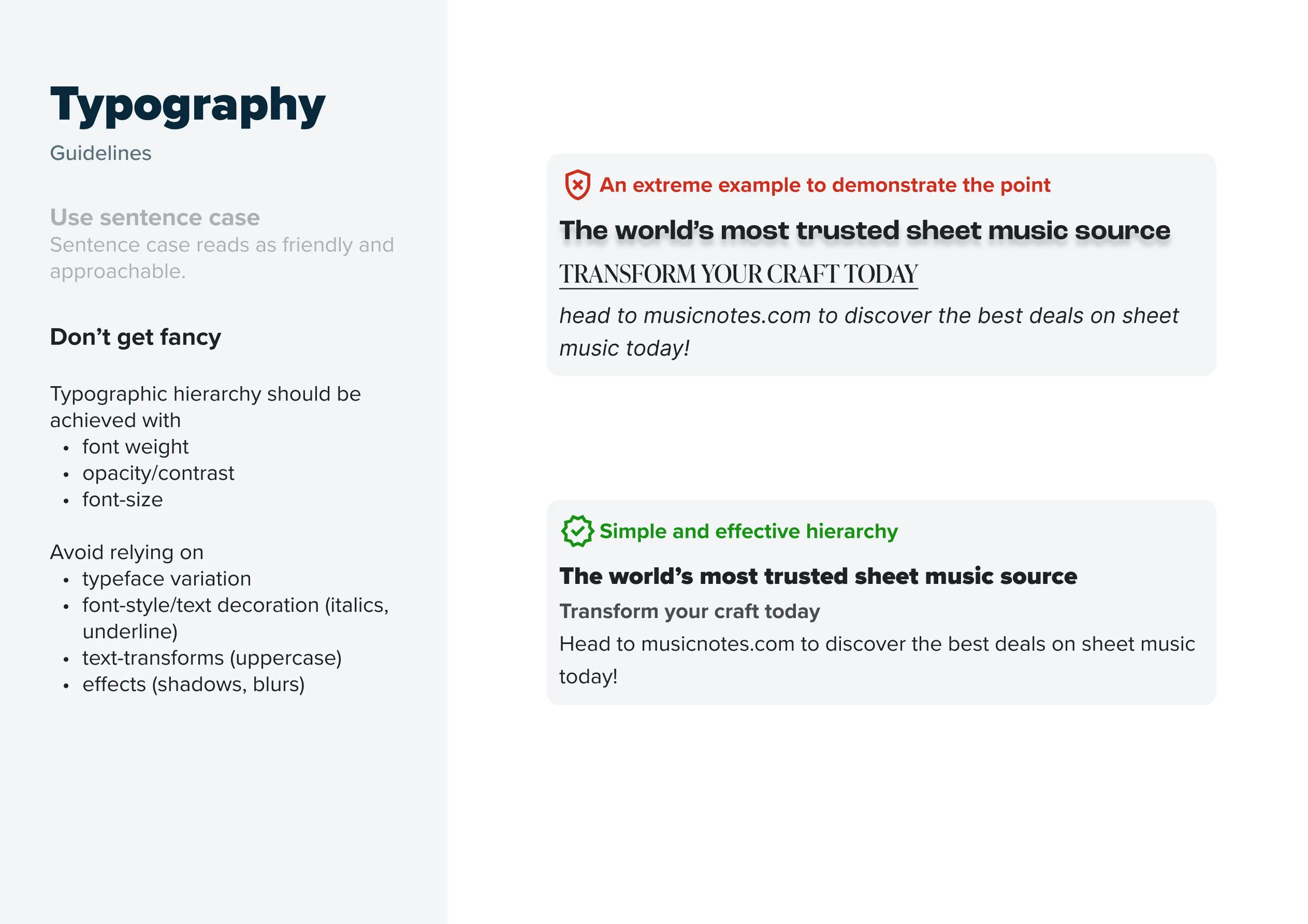
Typography
Legacy
Too many sizes, too many weights, too much reliance on text-transforms and italics... Accessibility issues caused by text color contrast, text size, line-length, inconsistent kerning and leading... It seemed like the answer to typographic hierarchy had always been more variation, rather than better contrast.

The Refresh
Once again relying on common UI libraries as a guide, I created a relatively simply font-stack for both the web (Proxima Nova) and the Mobile Apps (Helvetica Neue).
d4
d3
d2
d1
4xl
3xl
2xl
xl
lg
base
sm
xs
d4
d3
d2
d1
4xl
3xl
2xl
xl
lg
base
sm
xs
Why It Works
Now, we rely on visual weight created by contrasts in size, space, font-weight and opacity to create clearer typographic hierarchy. (In retrospect, I think I should have made these font-size options even more limited to ensure sufficient contrast at all times.)
Shadows
Legacy
Our shadows were heavy and often extended in all directions, undermining the illusion of a single light source.
Old shadows looked like this.
The Refresh
I created a few shadow variants in a setup that would be familiar to Tailwind/Bootstrap users.
shadow-sm
shadow
shadow-lg
shadow-xl
shadow-inset
Why It Works
They're more subtle and flexible enough to be used for hover and active state styles as well as graphic design displays.
Spacing
Legacy
Spacing values were inconsistent. This, along with the absence of CSS Grid and Flexbox often led to odd alignment of elements. Here's an example from the homepage. It's often subtle enough that most users couldn't point it out, but as designers we know that they sense the imbalance - the 'gestalt' is out of wack and it feels less trustworthy.

The Refresh
I implemented a simple loose 8pt spacing system to make padding, margin and vertical rhythm more consistent.

Why It Works
This is not revolutionary stuff, but just giving ourselves a few standardized spacing variables to reach for has brought more consistency to layouts - like grids with even gaps.
Corners
Legacy
Lack of border-radius on elements gave the interface a more technical and less welcoming feel.

The Refresh
Some simple values for rounded corners were useful in tidying this up.

Why It Works
Designers still have some discretion over when to use rounded-sm, rounded-md, rounded-lg, etc. But we're never haphazardly setting border-radius to weird values like 7 or 23 anymore.
Buttons
Legacy
Like the legacy color variables, Button classes were too opinionated and prescriptive. Styles and naming conventions placed undue emphasis on semantic usage rather than contextual hierarchy and caused the set of button styles on our platforms to balloon.

The Refresh
I implemented some simplified, less opinionated button specs.

Why It Works
Our buttons are more consistent and more flexible. Button text should convey information. Button styles should convey hierarchy through visual weight and placement.
Translating To Code
A Utility Class Library
I needed a relatively lightweight approach to implement these new design standards without impeding other development priorities. So I built something like a mini Tailwind with just the utility classes we'd need to apply the paint job.
/unisondesign
    /core
        _functions.scss
        _mixincs.scss
        _variables.scss
        _core.scss
    /properties
        _background.scss
        _borders.scss
        _cssgrid.scss
        _flexbox.scss
        _layout.scss
        _shadows.scss
        _spacing.scss
        _typography.scss
    main.scss
Working It In
During refinements, sprint planning and other product sessions, I kept my eye out for opportunities to implement these new visual design standards. I made an agreement with the backend devs as they worked on new features and bug fixes: 'You make it work, I'll make it pretty'.
This created space for collaboration, allowing me to checkout their branches and apply layout and styling in alignment with this new standard using these simple utility classes.
These new paint-by-numbers utility classes helped us axe hundreds of lines of old tangled CSS files and inline style tags!
Results
Legacy
Stale colors, sloppy shadows, unbalanaced layouts, poor typographic hierarchy:

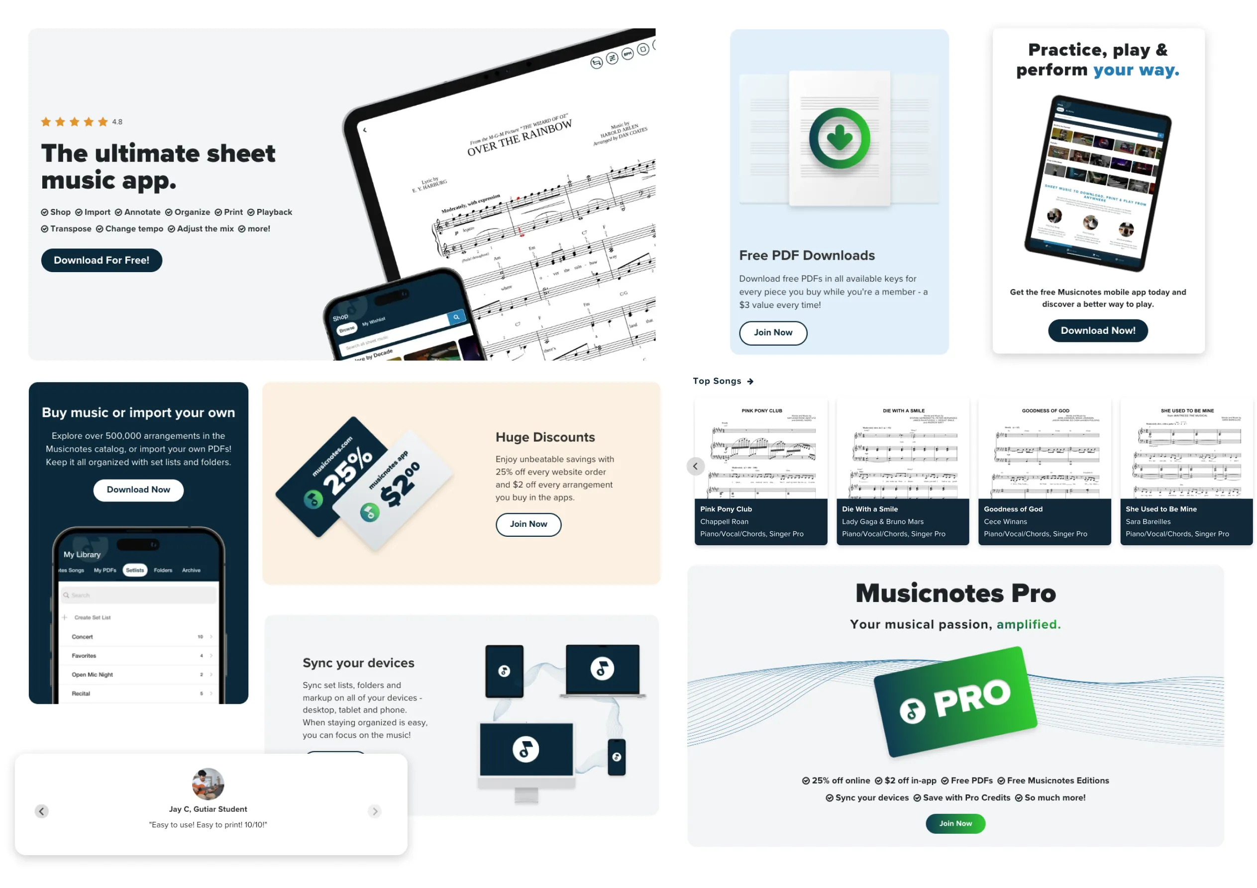
The Refresh
A more accessible, simple, consistent experience:

Keeping Others Aligned
The codebase isn't the only place these styles are applied. Marketing, graphic design, and other vendors all need guidance too. So I put together a practical, no frills brand style guide.


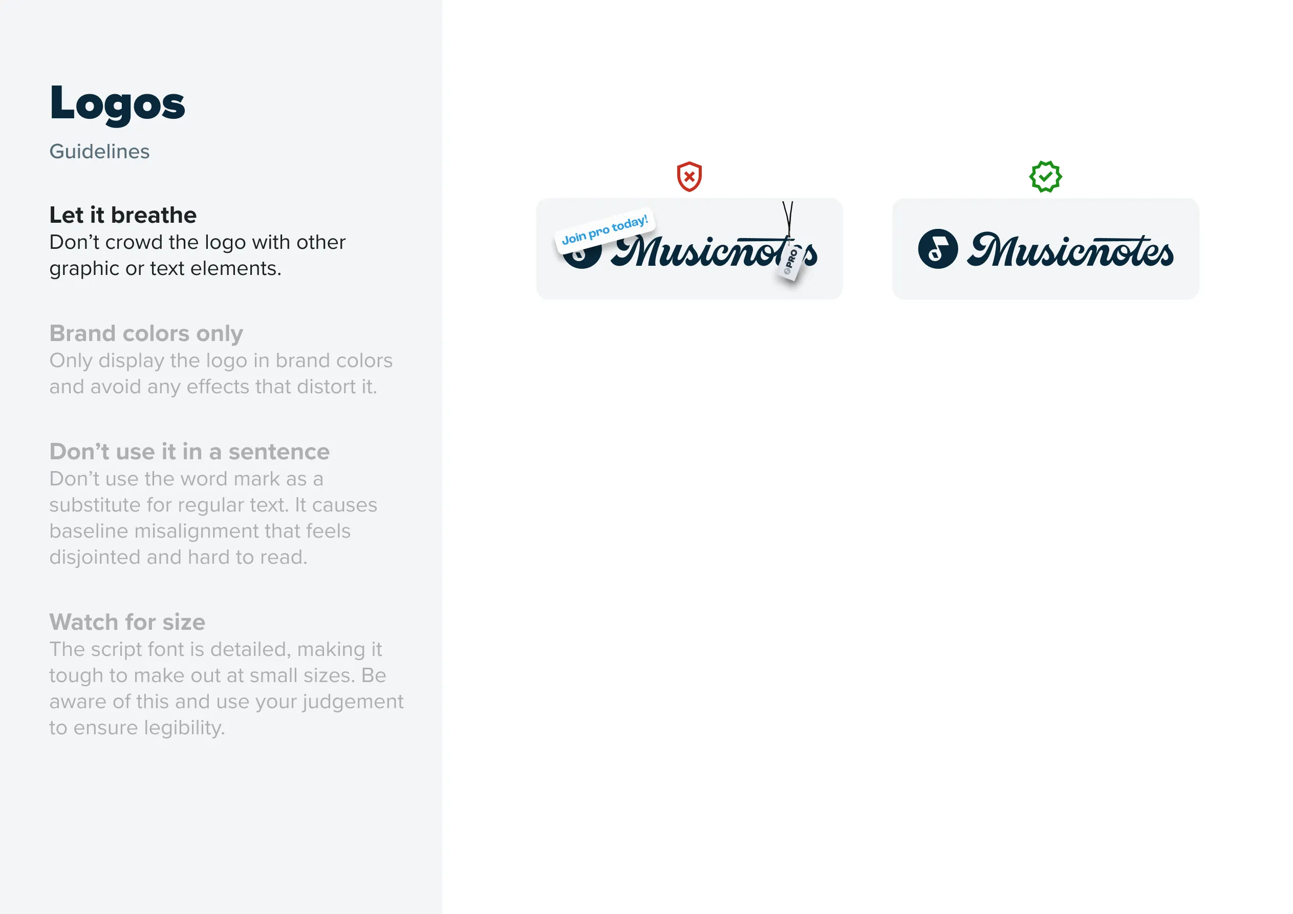
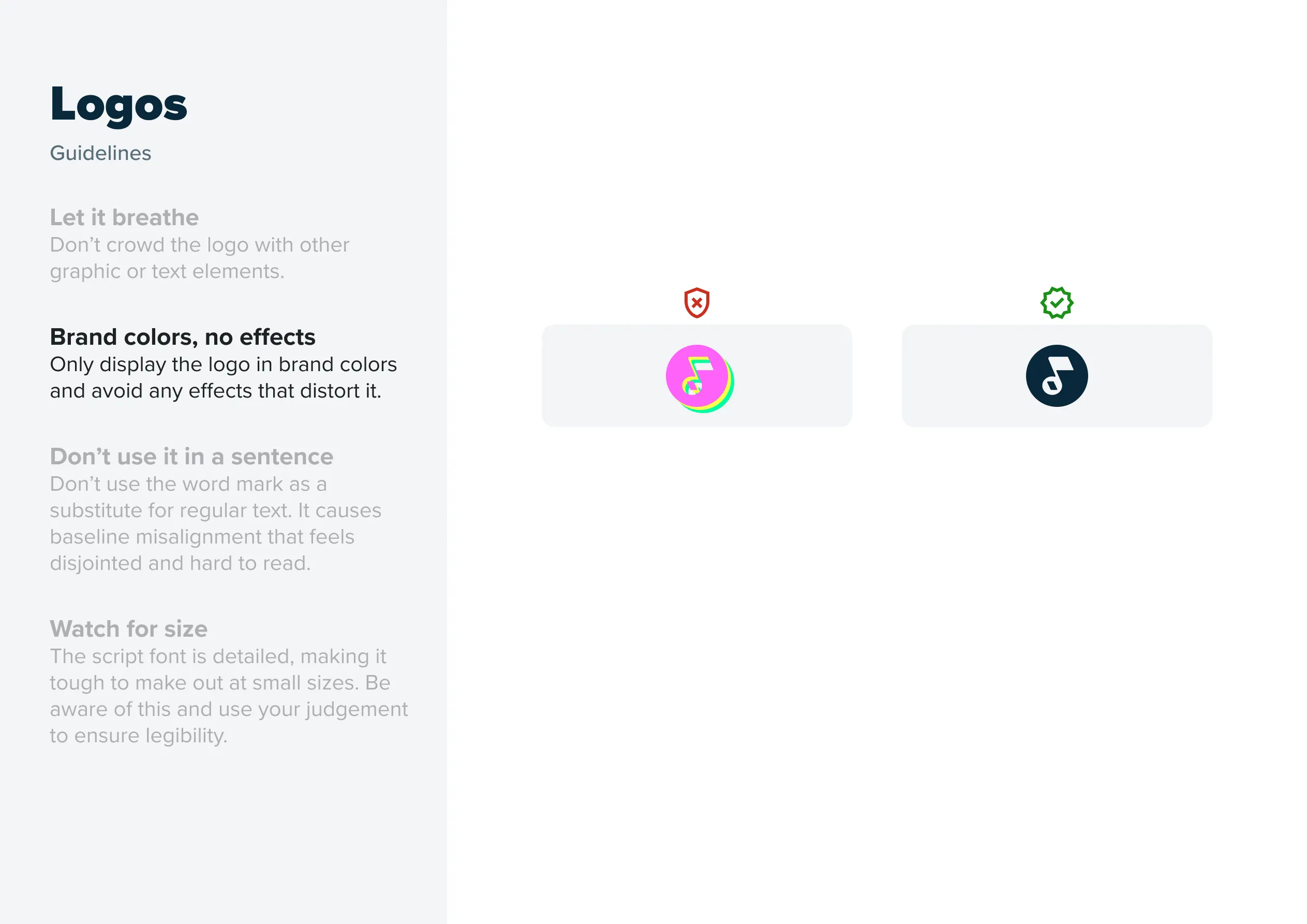
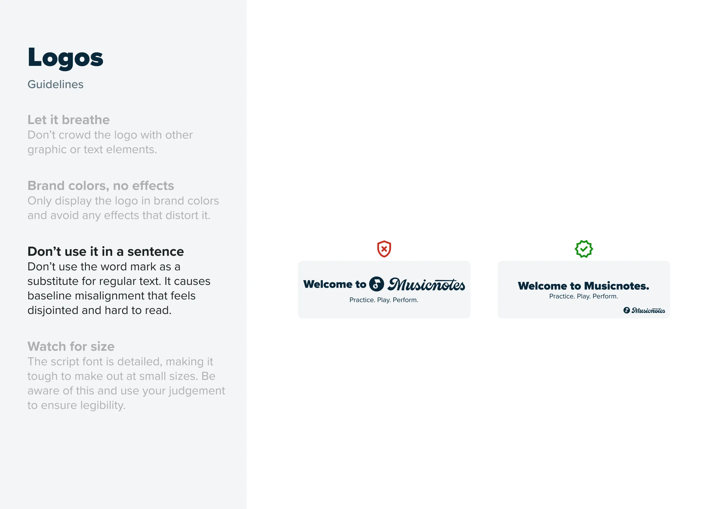
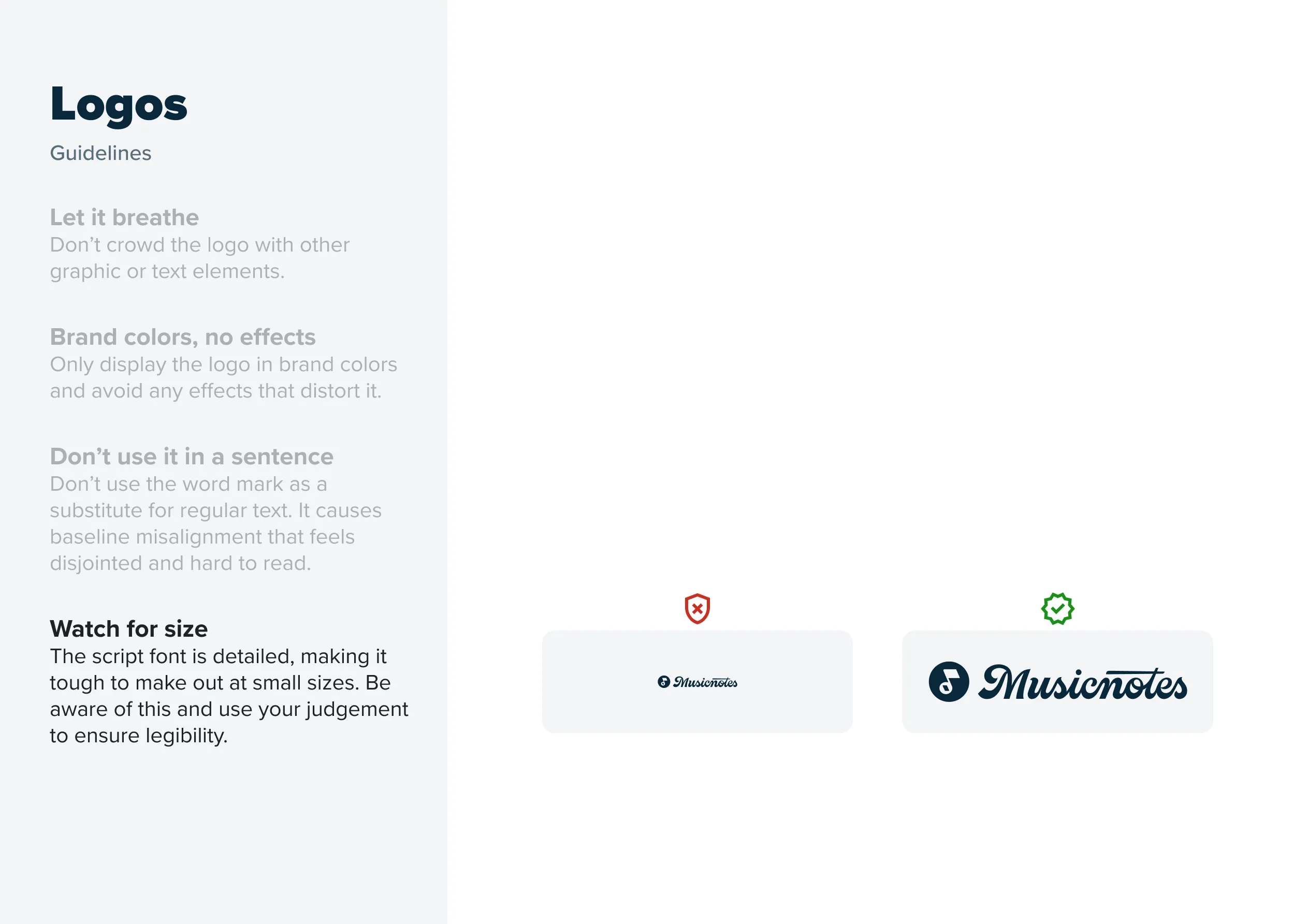
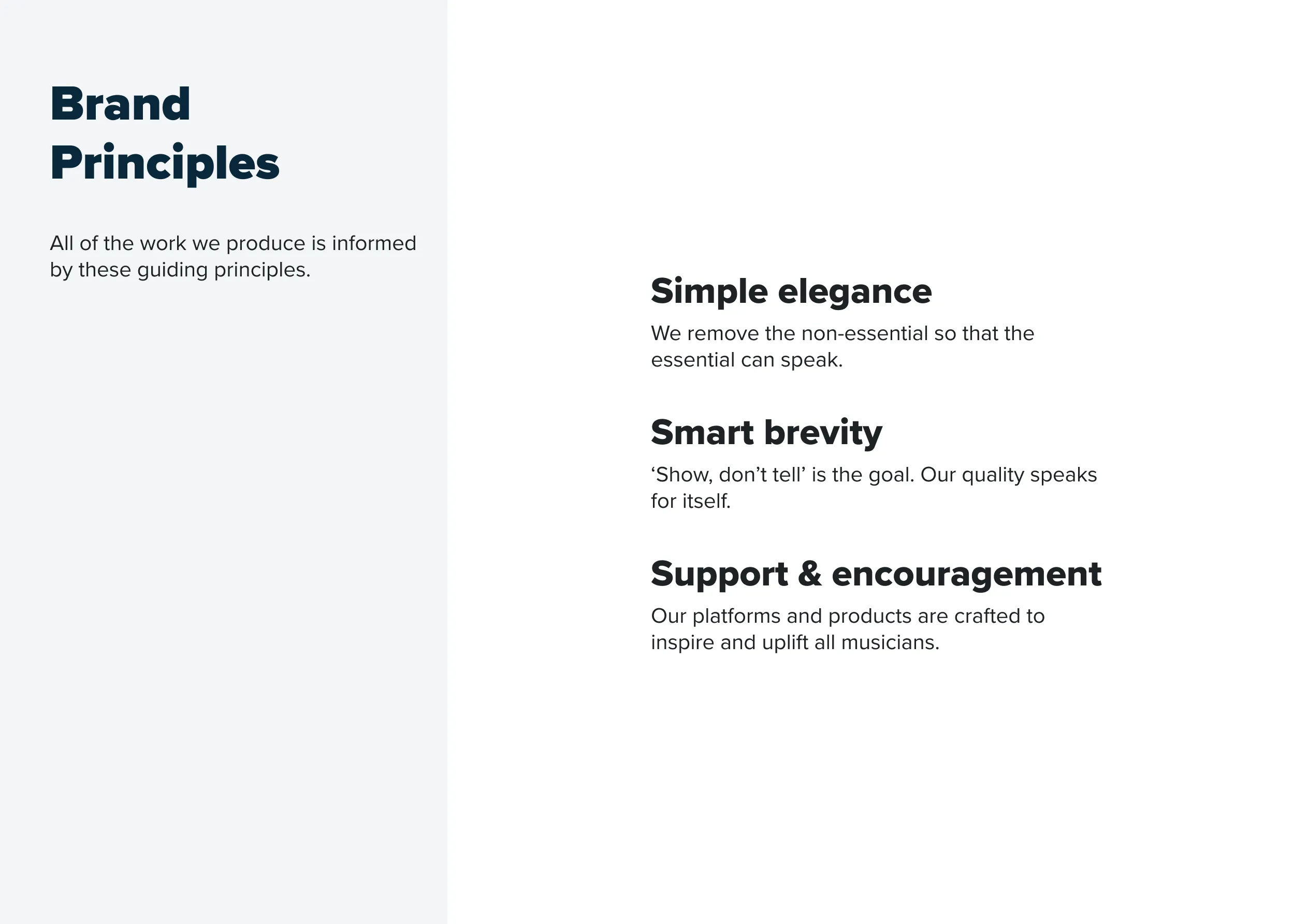
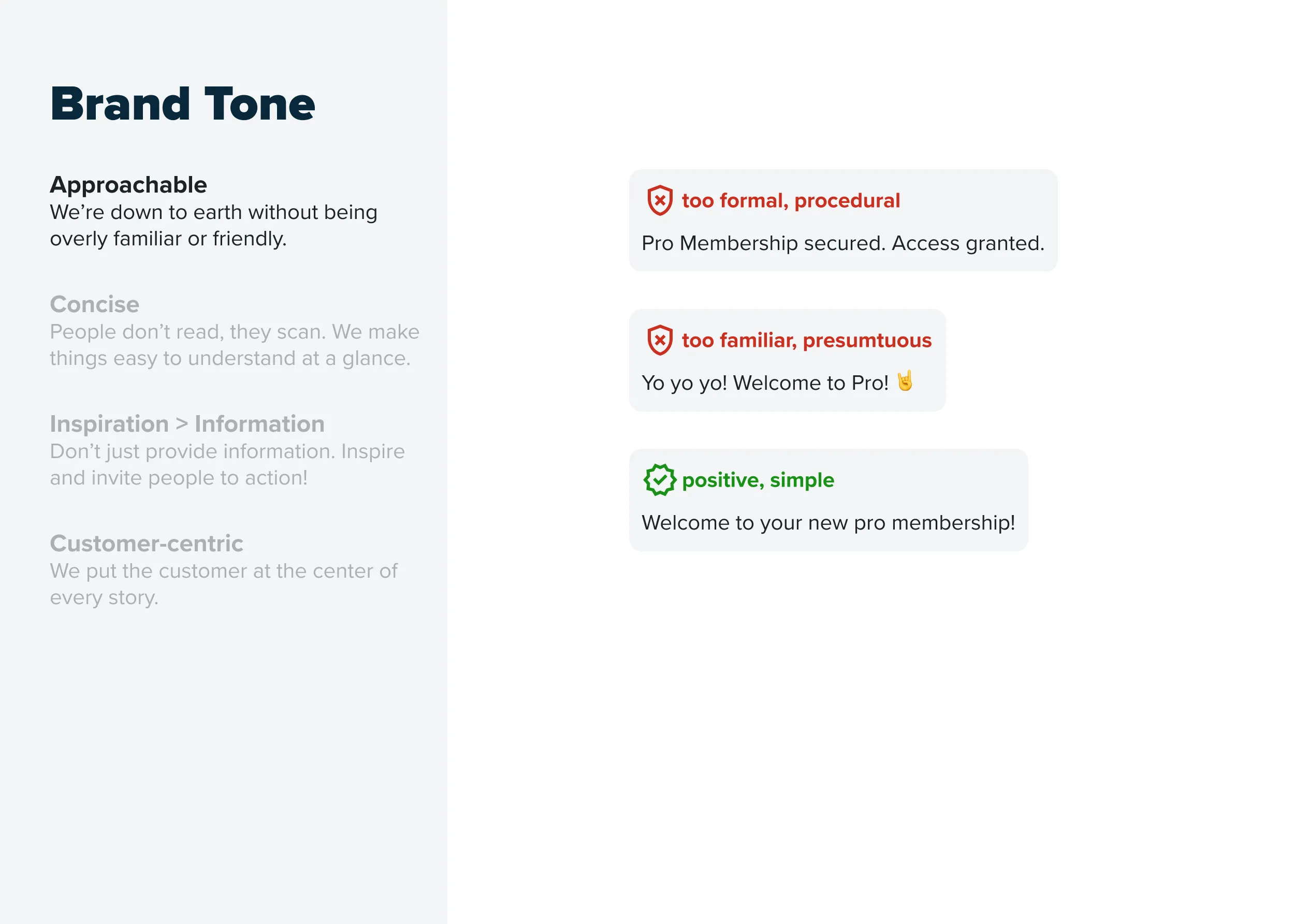
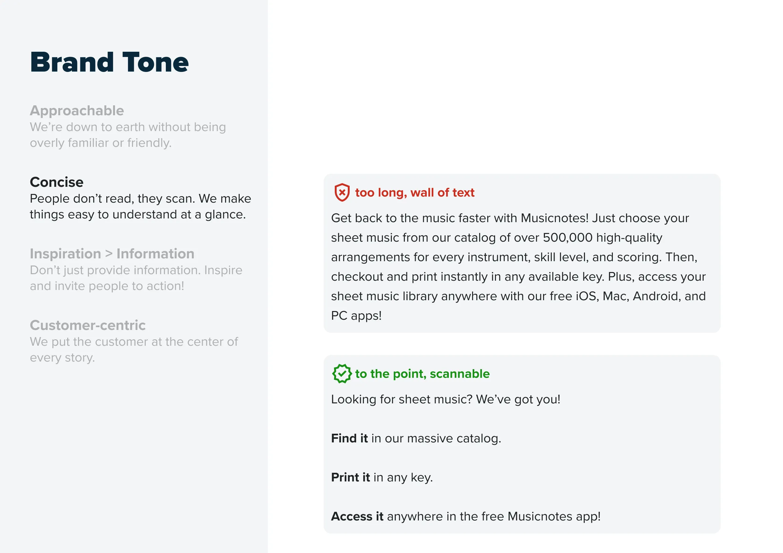
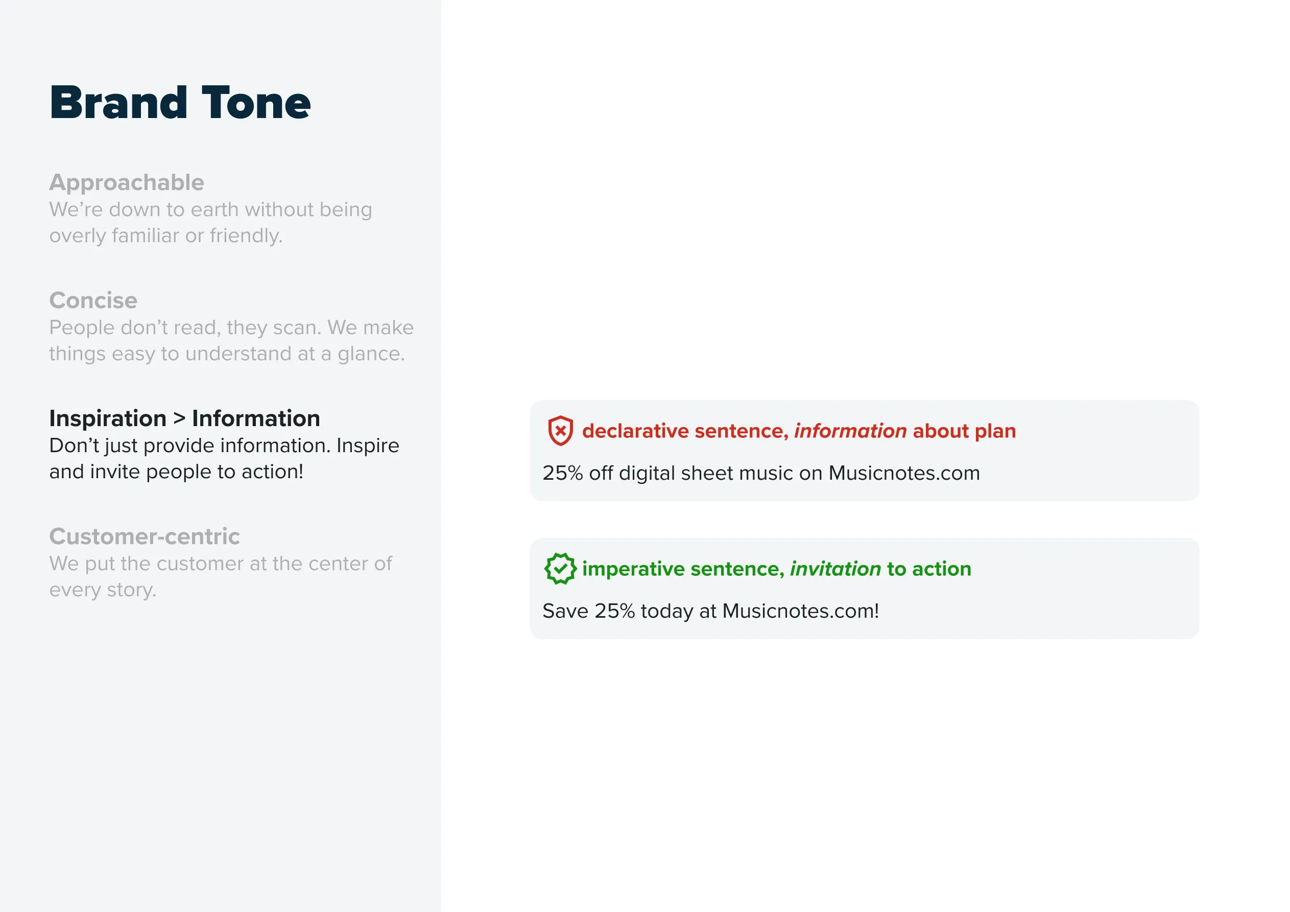
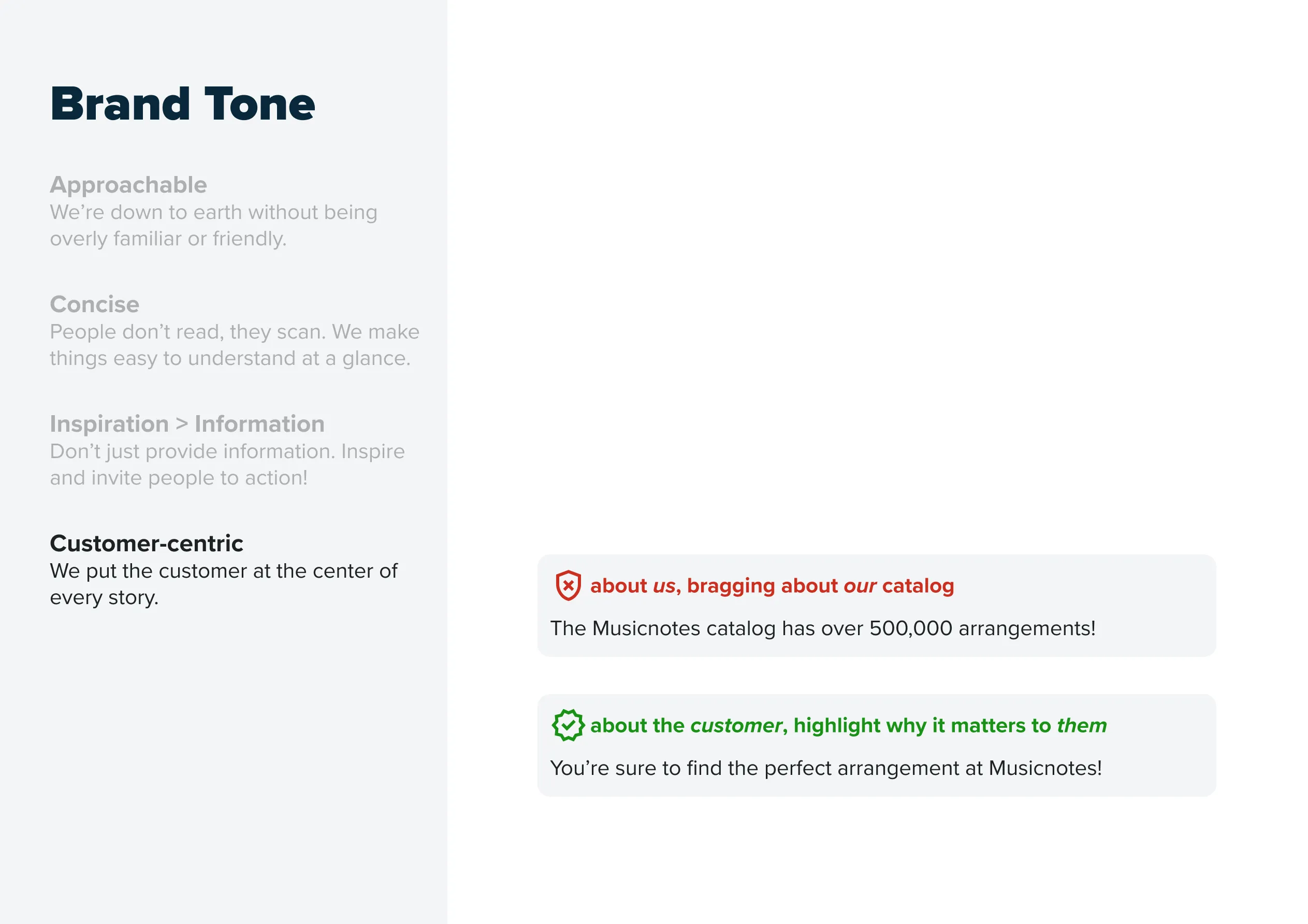

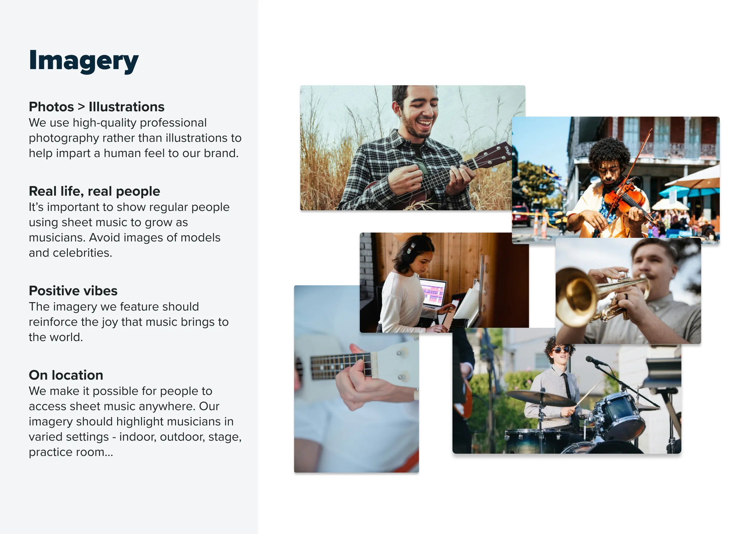
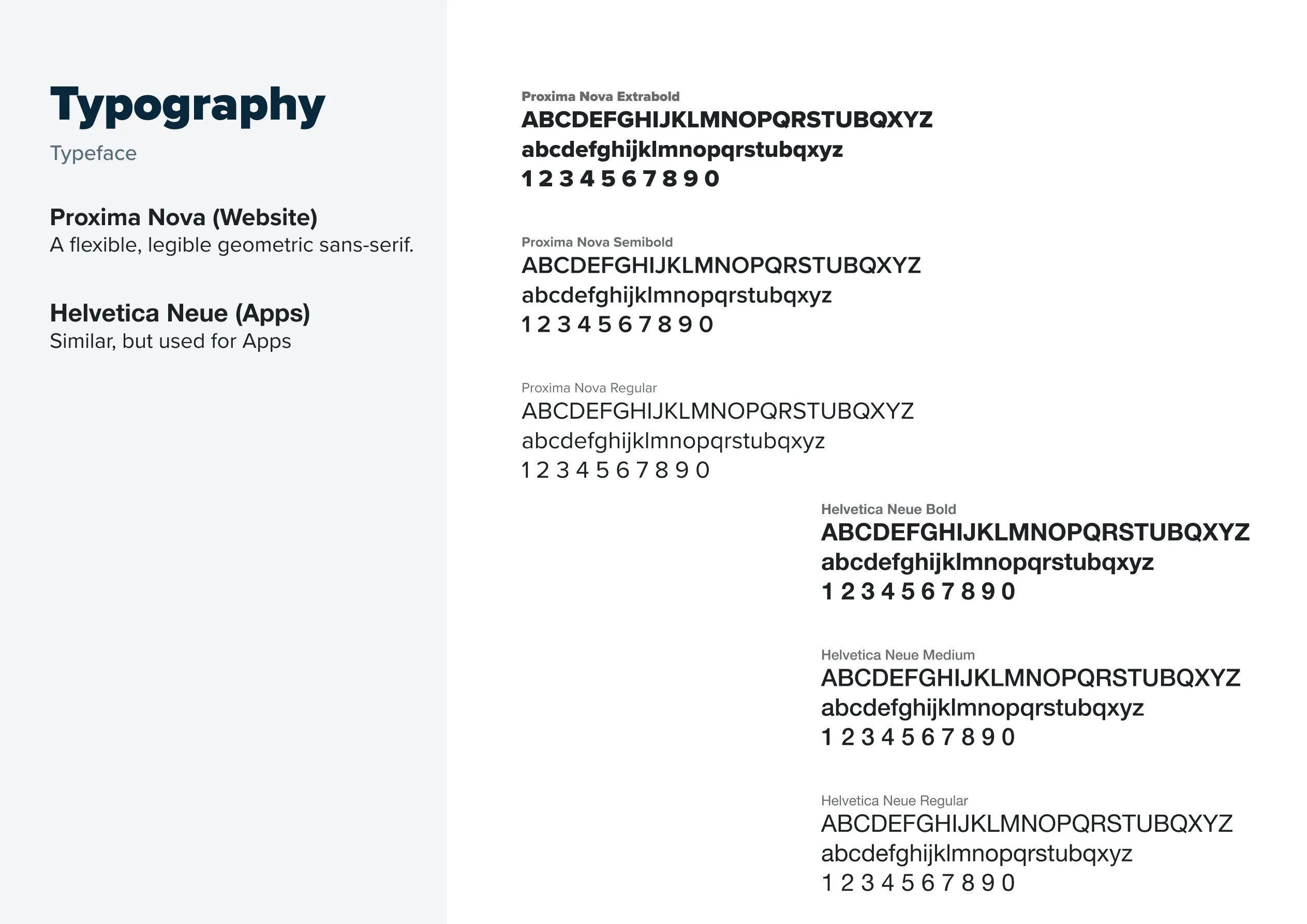
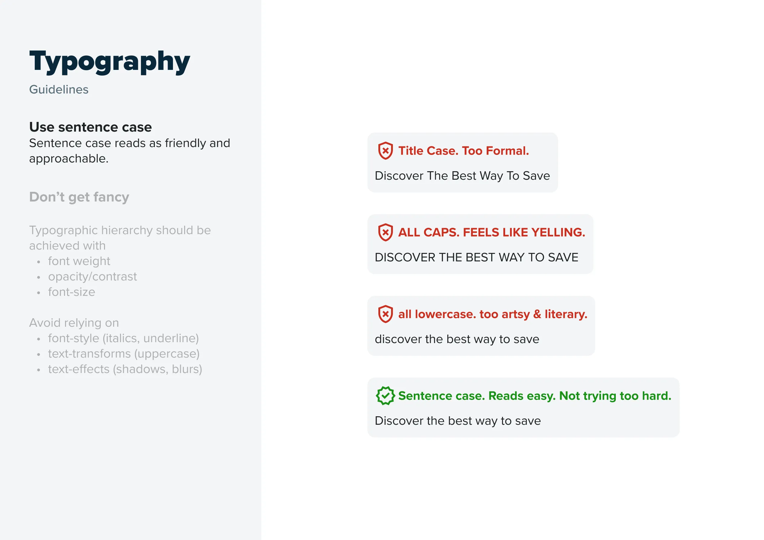
Brand Style Guide
A practical guide to brand alignment.
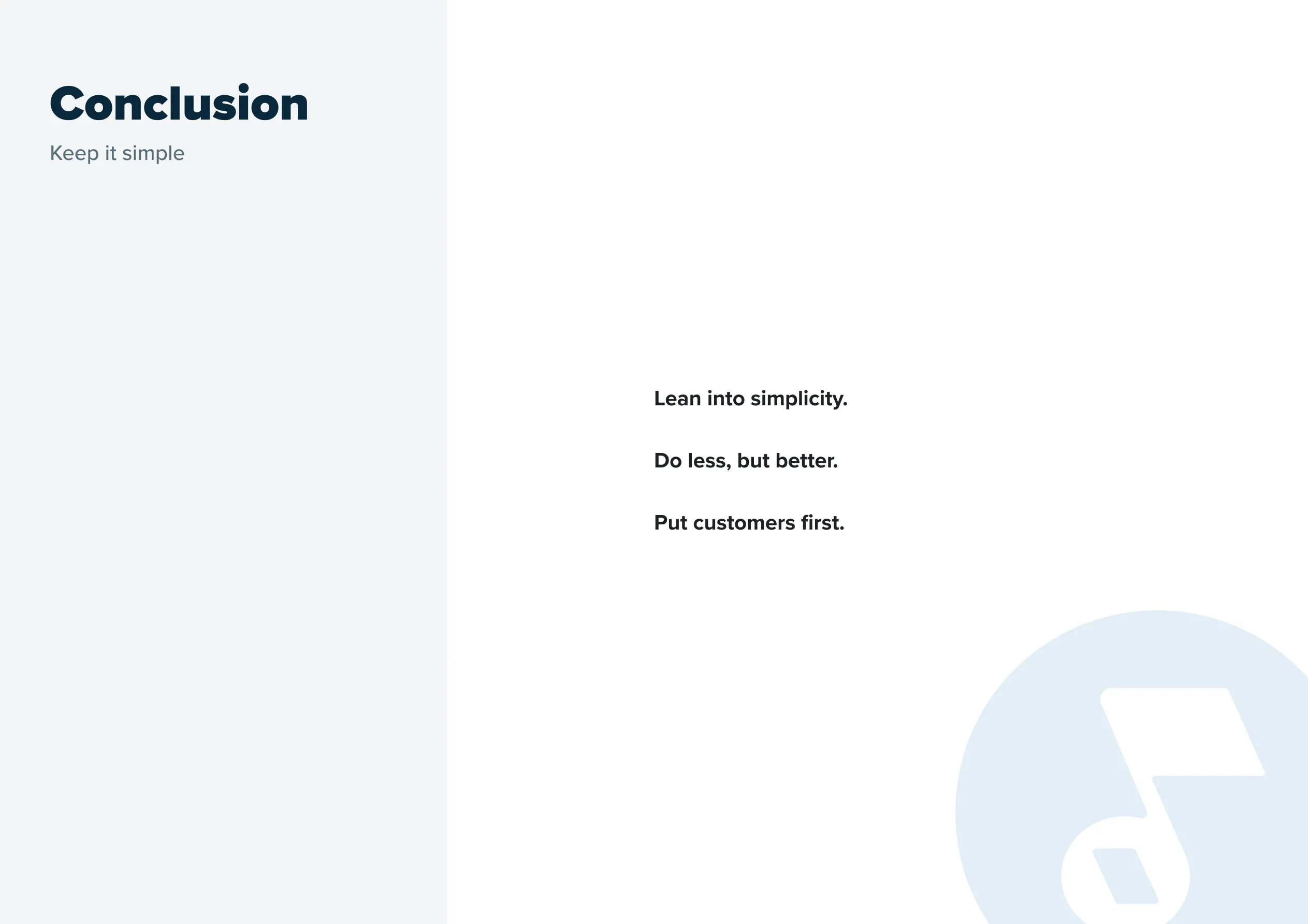
Final Thoughts
In the near future, I think we'll have an opportunity to expand upon this simple design token library and begin to think more atomically about components and how they fit together. I'd love to build out the component library in Figma and in code - possibly using tools like Storybook, Knapsack, etc. For now, this was a great exercise in working within the constraints of existing design and tech debt to creating impactful change.